

Gibbs Creek Farm is a family farm in Grand Forks, BC. They are nestled in a small valley with 2 creeks merging together through it. They pride themselves in being diverse, regenerative, with no spray, and small batch.
For their branding, I felt it was essential to stick to inviting, organic colours and easy-to-read fonts to reflect their brand values.
Programs used: Abobe Illustrators & Adobe InDesign
Programs used: Abobe Illustrators & Adobe InDesign
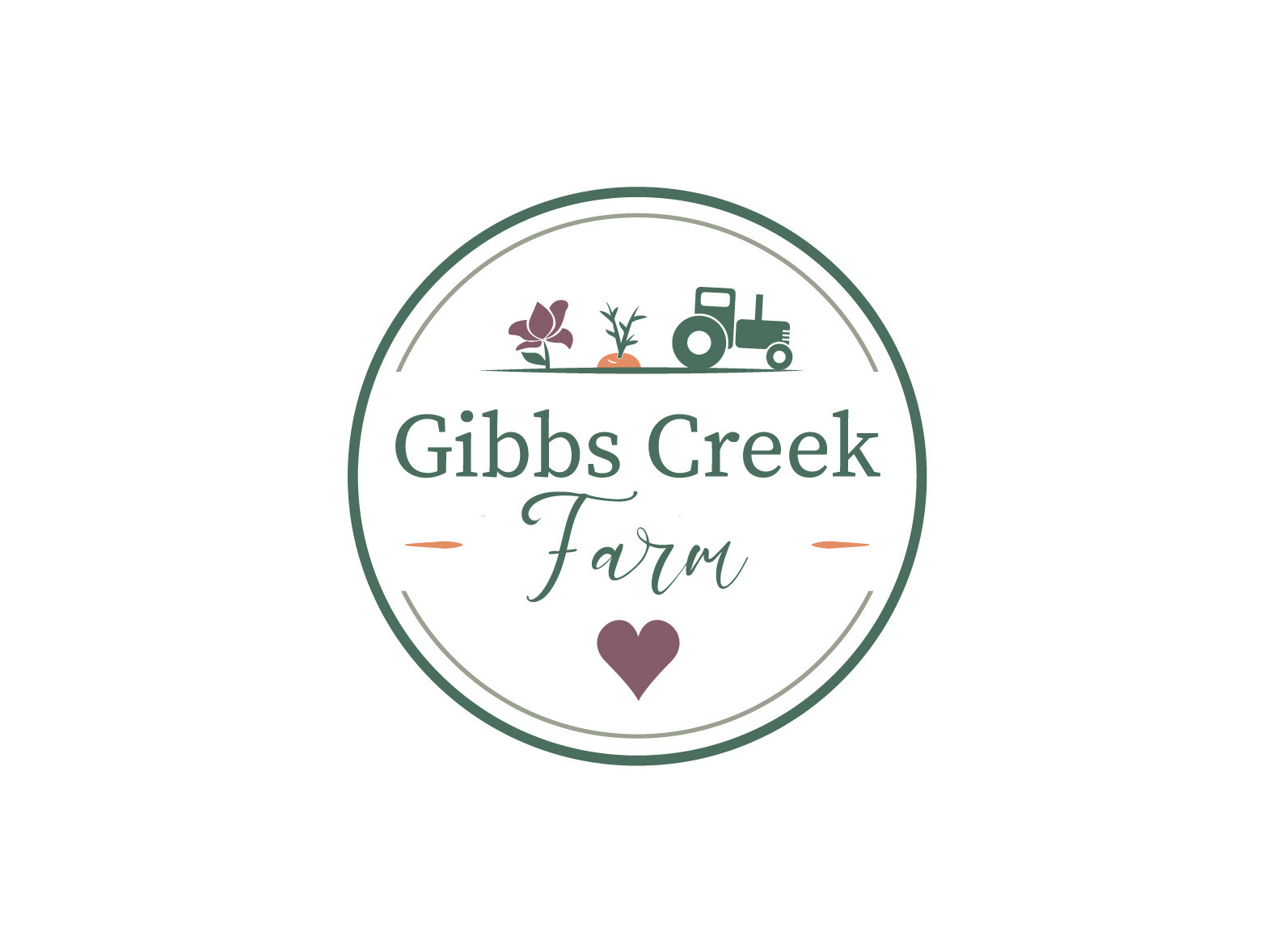
The Gibbs Creek Farm logo showcases a few aspects of the company. They provide their local community with beautiful flowers and fresh produce. They use a small tractor to get most of their work done. Last but not least, it's all done with the personal love and care of the Cameron-Gavin family.
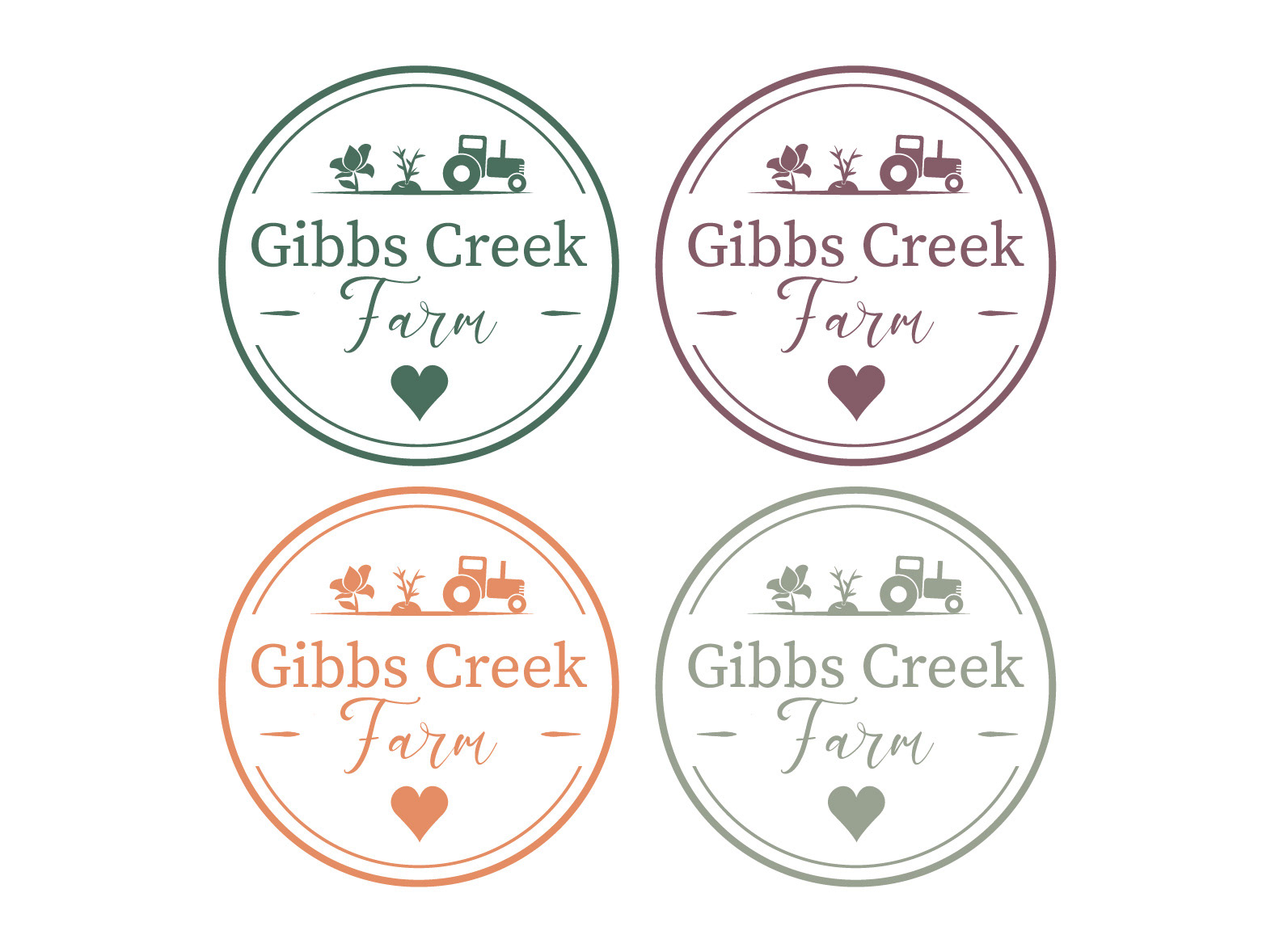
Monochrome logos in all brand colours.
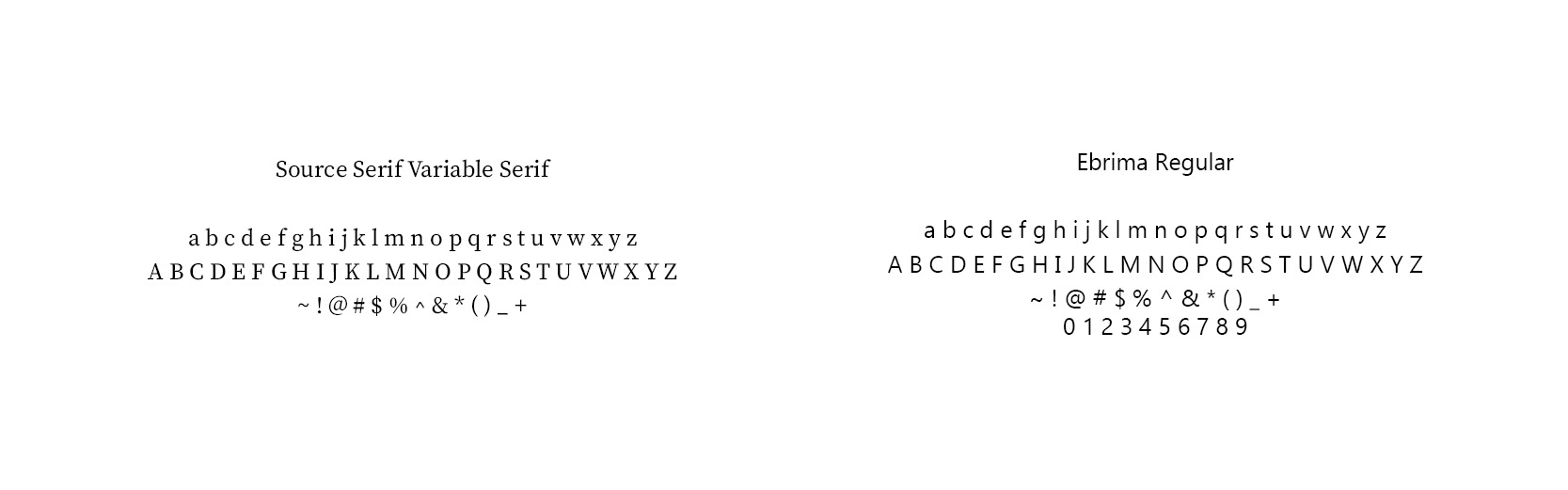
For this brand it was important to stick to easy-to-read fonts that reflect the warm and inviting nature of this family farm. Source Serif Variable has subtle serifs for a bit of flare but not too overpowering to make it stand out. Ebrima is a classic and simple sans-serif.
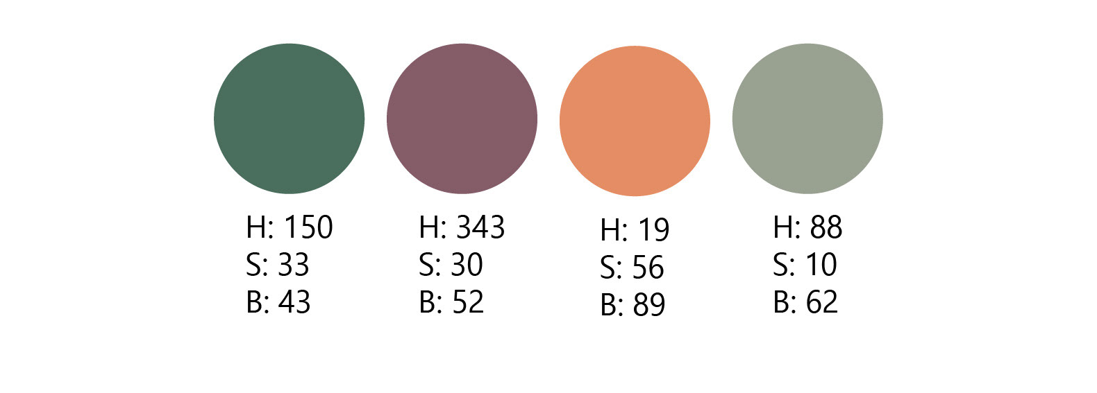
The brand colours are warm and organic to reference what is produced at the farm. It is surrounded by nature, represented by green and gray. The flowers are represented by the mauve. The orange represents the nutritious vegetables and other food produced here.
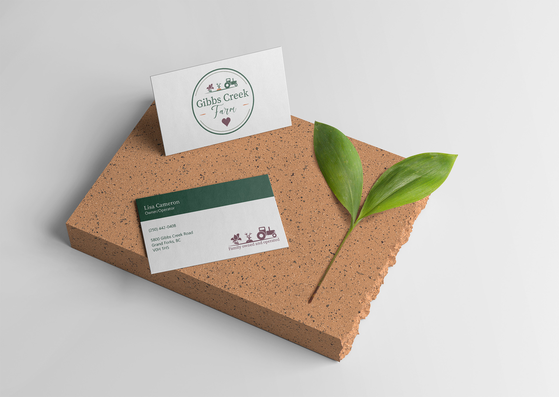
Business card mock-up.
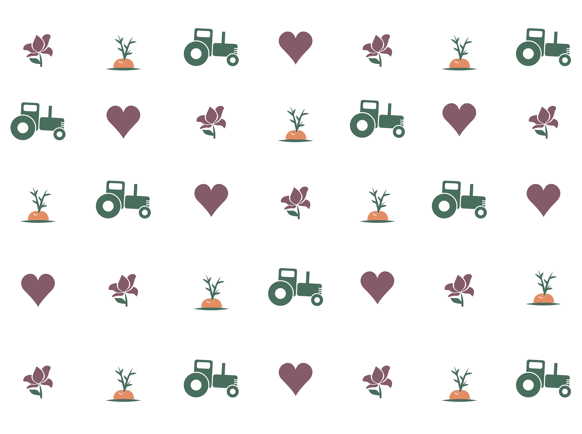
Brand pattern